Core Thought: A Refined Display Font for Digital Branding
There it was—my client’s new coaching website hero section, live in Figma, and the headline just felt… polite. Not warm. Not memorable. Not them. I swapped in Core Thought on instinct, typed “Clarity Starts Here,” and stepped back. Instantly, the space breathed differently. Lighter. Smarter. Intentional. That’s when I knew this wasn’t just another pretty display font—it was a quiet brand amplifier.
What Core Thought Brings to the Screen
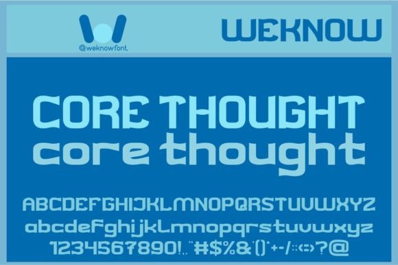
Core Thought is an elegant, sophisticated display font built for impact—not decoration. Its letterforms balance subtle contrast with graceful curves: soft serifs that don’t shout, generous x-heights that hold up beautifully at medium sizes, and even spacing that invites scanning rather than straining. It’s not ornate or overly stylized; instead, it feels like a thoughtful conversation—calm, confident, and quietly refined. As a display font, it thrives where attention matters most: headlines, banners, section dividers, and branded callouts.
I tested Core Thought across multiple real web contexts—a boutique online store’s product launch banner, a course sales page’s value proposition header, a portfolio site’s “Work” section title, and a blog’s featured post card. In every case, it elevated perceived professionalism without sacrificing warmth. Unlike some decorative fonts that feel distant or cold, Core Thought carries a gentle human rhythm—like handwriting polished by intention, not automation.
How It Performs in Real Layouts
On desktop, Core Thought shines at 48–72px for hero titles—crisp, legible, and full of presence. At 32–40px for section headings, it maintains clarity even over textured image backgrounds (I tested it over muted linen overlays and soft gradient banners). On mobile? I kept it at 28–36px with tight but comfortable letter-spacing (+0.5px), and it held its own—no blurring, no awkward gaps, no lost detail.
One test stood out: a dark-mode landing page with white text over charcoal. Core Thought remained highly readable thanks to its open counters and balanced stroke weight—no visual “clogging” in smaller sizes. And because it’s a well-hinted, modern OpenType font, it rendered cleanly across Chrome, Safari, and Firefox—even with variable font fallbacks disabled.
Where It Fits—and Where It Doesn’t
Core Thought excels as a hero headline font, section title anchor, and brand signature element—think “Our Approach,” “Join the Circle,” or “The Studio.” It also works beautifully for short, high-impact CTAs (“Begin Your Journey,” “Explore Collections”) when paired with ample whitespace.
It’s intentionally not designed for body copy, navigation menus, form labels, or dense dashboard interfaces. Its charm lies in restraint: use it for moments that deserve pause, not persistence. For long paragraphs or interface text, pair it with a clean, highly legible sans serif—think Inter, Manrope, or even a neutral system font stack. That contrast creates hierarchy, not competition.
I avoided using Core Thought below 24px in production layouts—even with ideal contrast—because its delicate terminals and subtle serifs begin to soften on lower-DPI screens. And while it supports Latin-based languages well, I double-checked multilingual support before finalizing a bilingual client project: Core Thought includes extended Latin characters, but no Cyrillic or Arabic glyphs, so I confirmed scope early.
Smart Pairing for Digital Harmony
The magic of Core Thought isn’t just in its solo performance—it’s how gracefully it partners with supporting type. My go-to pairing is Core Thought (Regular or Medium) for headlines + Inter (SemiBold for subheads, Regular for body). The result feels editorial yet approachable—like a thoughtfully designed magazine landing on your screen.
For a more distinctive voice, I’ve paired it with a low-contrast serif like Lora for subheads—adding texture without clutter. And for brands leaning into calm minimalism, a monospace accent (like Recursive) for code snippets or feature tags adds delightful contrast without breaking tone.
Crucially, Core Thought comes with true italics—not slanted fakes—and includes stylistic alternates and ligatures. I used the swash capital “C” sparingly in a logo lockup and the discretionary “&” in a footer tagline. These details matter—they’re the polish that signals care, especially in premium digital offerings like course sales pages or brand kits.
Practical Notes Before You Implement
Before dropping Core Thought into a live site or client project, I always verify three things: First, that the webfont files (.woff2 preferred) are included and optimized—Core Thought delivers lightweight, well-structured webfont packages. Second, that licensing covers commercial use across domains, SaaS platforms, and embedded templates (it does—standard commercial license applies). Third, that I’ve tested fallback behavior: defining a clear font stack like font-family: "Core Thought", Georgia, serif; ensures graceful degradation if loading fails.
For designers using Figma or Adobe XD, the OTF files integrate seamlessly—and the consistent metrics mean mockups translate cleanly to dev handoff. No surprises, no reflow, no last-minute kerning tweaks.
At its core—pun intended—Core Thought isn’t about flash. It’s about focus. It guides the eye, affirms tone, and makes digital spaces feel considered. Whether you’re launching a new service, refining a portfolio, or building trust through a landing page, this display font doesn’t distract—it deepens. And in today’s fast-scrolling, high-noise web, that kind of quiet strength is rare. And invaluable.